Appointment View Flags v 7.2
- Rickliftig
- Posts: 764
- Joined: Thu Jul 10, 2008 4:50 pm
- Location: West Hartford, CT
- Contact:
Appointment View Flags v 7.2
Some thoughts:
I like the circle for confirmed status. But the small rectangular box for insurance gets obscured by the border highlight when that pt is selected. The boxes are way too narrow . I'd like to see these boxes wider or have the option of circles.
I'm also still pushing to have different colors that can be assigned to the patient name - these could be used as flags also. ie - red pt is trouble.
I entered in several appointment fields and they work fine, but it just seems like a clumsy way to assign them, especially since they will often be stock phrases. How about a radio button selection in the edit appt window?
The insurance waiting to send doesn't work for a future appt. (not that that's a problem)
Another Happy Open Dental User!
Rick Liftig, DMD FAGD
University of CT 1979
West Hartford, CT 06110
srick@snet.net
Rick Liftig, DMD FAGD
University of CT 1979
West Hartford, CT 06110
srick@snet.net
Re: Appointment View Flags v 7.2
yes,
1) the radio options would be great, (Y/N) for starters
2) sticky fields I think would add a lot....then you could have a field for (Always Call 1 hr prior to appt field) and have it always show up on their appts.
3) yes, you can't see the I for the" pt having ins" on some columns, it seems the spacing is slightly different for different columns (we have 7 currently)
4) option to set background colors would be great
- jordansparks
- Site Admin
- Posts: 5755
- Joined: Sun Jun 17, 2007 3:59 pm
- Location: Salem, Oregon
- Contact:
Re: Appointment View Flags v 7.2
I think our PatientFields will finally catch on if we add them to appointment views. Everyone has sort of ignored them so far. I've always wanted to dramatically enhance them. So now that people will start using them, maybe that will build the consensus to enhance them. For example, specify type as boolean, date, time, int, enum, etc. Perform actions on them as a group for maintenance purposes. Hide ones that are no longer used. Tie them to our automation (I'm still vague on how that would work). And so on.
Jordan Sparks, DMD
http://www.opendental.com
http://www.opendental.com
Re: Appointment View Flags v 7.2
Rick, I was planning on using the "address and phone notes" box in the patient edit window (from Family Module) to add codes for patients...A/B/C - based on likeability/pays on time/shows up for appts, perceived DISC profile, and disease risk level. Each code letter or number can be listed vertically in the box and it shows up in the family module and on appt. scroll-over balloons. Hopefully, the patient fields system will be better than this though...I'll try it out once I update to 7.2
The appointment background color is my most desired feature request and I have pledged cash for it. It's currently at #5 or so on the request list so hopefully it isn't too far off. It will greatly improve our staff's effectiveness for the rock/sand/water method of scheduling that we do.
Ryan
The appointment background color is my most desired feature request and I have pledged cash for it. It's currently at #5 or so on the request list so hopefully it isn't too far off. It will greatly improve our staff's effectiveness for the rock/sand/water method of scheduling that we do.
Ryan
- Rickliftig
- Posts: 764
- Joined: Thu Jul 10, 2008 4:50 pm
- Location: West Hartford, CT
- Contact:
Re: Appointment View Flags v 7.2
I had posted this about a year ago - this seems like a good time to re-post.
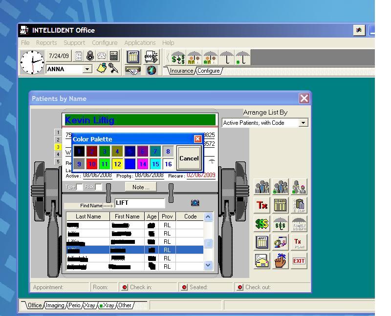
This is a screenshot from my old PM program Intellident for Windows c. 1999) - note that the background color and the color of the patient name is customizable. There is a series of flags on the side that can be clicked on or off (and colored) as necessary. All through the Intellident program, icons would change color when there was information associated with them. In OD, I can envision this as: the perio chart button changing color or indicating the last date recorded; same with the consent button and others.

It's REALLY funny to see a teeny icon for the appointment book in the top and to realize the program is very old school, front desk, paper chart centric. Can't see myself going back there!
One other neat thing was the ability to highlight a telephone number field and have it auto-dial (but I digress).
This is a screenshot from my old PM program Intellident for Windows c. 1999) - note that the background color and the color of the patient name is customizable. There is a series of flags on the side that can be clicked on or off (and colored) as necessary. All through the Intellident program, icons would change color when there was information associated with them. In OD, I can envision this as: the perio chart button changing color or indicating the last date recorded; same with the consent button and others.

It's REALLY funny to see a teeny icon for the appointment book in the top and to realize the program is very old school, front desk, paper chart centric. Can't see myself going back there!
One other neat thing was the ability to highlight a telephone number field and have it auto-dial (but I digress).
Another Happy Open Dental User!
Rick Liftig, DMD FAGD
University of CT 1979
West Hartford, CT 06110
srick@snet.net
Rick Liftig, DMD FAGD
University of CT 1979
West Hartford, CT 06110
srick@snet.net
- Rickliftig
- Posts: 764
- Joined: Thu Jul 10, 2008 4:50 pm
- Location: West Hartford, CT
- Contact:
Re: Appointment View Flags v 7.2
Just tried the new version 7.2.4.0 - the flags are much better. Anyway the "ins waiting to send box can be bolded? The colored exclamation point really doesn't show well. A filled box would also work well.
Thanks!
Thanks!
Another Happy Open Dental User!
Rick Liftig, DMD FAGD
University of CT 1979
West Hartford, CT 06110
srick@snet.net
Rick Liftig, DMD FAGD
University of CT 1979
West Hartford, CT 06110
srick@snet.net
Re: Appointment View Flags v 7.2
Come on Rick, have some sensitivity......
Everytime I see an Intellident screen shot, it brings a tear to my eye.
It's been six years since I lost her, but the pain and sorrow still lingers on.
There will never be another one quite like her.
Now I must go and crack another cold one in her memory.
RIP, my sweets.
Cheers!!
Everytime I see an Intellident screen shot, it brings a tear to my eye.
It's been six years since I lost her, but the pain and sorrow still lingers on.
There will never be another one quite like her.
Now I must go and crack another cold one in her memory.
RIP, my sweets.
Cheers!!
Candy is dandy, but sex won't rot your teeth.
Cheers!!!
Go Bears!!!!!
Savvy
Cheers!!!
Go Bears!!!!!
Savvy
- Rickliftig
- Posts: 764
- Joined: Thu Jul 10, 2008 4:50 pm
- Location: West Hartford, CT
- Contact:
Re: Appointment View Flags v 7.2
She burned me - Now my heart belongs to Jordansavvy wrote:Come on Rick, have some sensitivity......
Everytime I see an Intellident screen shot, it brings a tear to my eye.
It's been six years since I lost her, but the pain and sorrow still lingers on.
There will never be another one quite like her.
Another Happy Open Dental User!
Rick Liftig, DMD FAGD
University of CT 1979
West Hartford, CT 06110
srick@snet.net
Rick Liftig, DMD FAGD
University of CT 1979
West Hartford, CT 06110
srick@snet.net
Re: Appointment View Flags v 7.2
So where is the automation feature? I was wondering if it has been placed on the back burner?
- jordansparks
- Site Admin
- Posts: 5755
- Joined: Sun Jun 17, 2007 3:59 pm
- Location: Salem, Oregon
- Contact:
Re: Appointment View Flags v 7.2
Main menu, setup, automation.
Jordan Sparks, DMD
http://www.opendental.com
http://www.opendental.com